 This is an example of a standardized choropleth map. The above map classifies the Australian climate, each color represents a different type of climate.
 http://ahunsberger.blogspot.com/2007/10/examples-of-choropleth-maps_17.html
 This is an example of a standardized choropleth map. The above map classifies the Australian climate, each color represents a different type of climate.
  Nominal area choropleth graphs are choropleth graphs that show nominal data. The different colors in this graph represent different data, the different minority groups.
 Isohyets are lines that connect areas of equal rainfall. The above map is of Australia and its median rainfall based on a 100 year climatology.
 An isotach is a line that connects points of equal wind power. The map above is of the annual average wind power in the United States, the darker shapes have stronger wind power than the lighter ones.
 Light Detection and Ranging (LIDAR) measures properties of scattered light waves to find information on distant targets, such as range. The LIDAR image above is of lower Manhattan.
 A similarity matrix is a matrix of scores that is used to determine if one set of data points is similar to another.
 The correlation Matrix describes a correlation among the variables of the matrix.
  This unclassed choropleth map shows the flash density of lightning across the United States. Unclassed choropleth maps are not restrained by boundaries.
 This classed choropleth map shows the percentage of individuals who are living in poverty in the year 2000. It is marked by county and the data is arranged in quartiles.
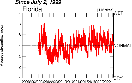 An index value plot allows the reader to be able to determine how the data relates to what is considered normal. In this graph, the average streamflow is measured and the graph shows how that data relates.
 Range graded proportional circle maps are maps that use circles to represent data and those circles' size is determined by the amount of data. For example, the map above's circles are larger depending on the number of Mexicans living in that state.
 Isobars are lines that connect points of equal atmospheric pressure, as in the map above.
