 This is an example of a standardized choropleth map. The above map classifies the Australian climate, each color represents a different type of climate.
 http://ahunsberger.blogspot.com/2007/10/examples-of-choropleth-maps_17.html
 This is an example of a standardized choropleth map. The above map classifies the Australian climate, each color represents a different type of climate.
  Nominal area choropleth graphs are choropleth graphs that show nominal data. The different colors in this graph represent different data, the different minority groups.
 Isohyets are lines that connect areas of equal rainfall. The above map is of Australia and its median rainfall based on a 100 year climatology.
 An isotach is a line that connects points of equal wind power. The map above is of the annual average wind power in the United States, the darker shapes have stronger wind power than the lighter ones.
 Light Detection and Ranging (LIDAR) measures properties of scattered light waves to find information on distant targets, such as range. The LIDAR image above is of lower Manhattan.
 A similarity matrix is a matrix of scores that is used to determine if one set of data points is similar to another.
 The correlation Matrix describes a correlation among the variables of the matrix.
  This unclassed choropleth map shows the flash density of lightning across the United States. Unclassed choropleth maps are not restrained by boundaries.
 This classed choropleth map shows the percentage of individuals who are living in poverty in the year 2000. It is marked by county and the data is arranged in quartiles.
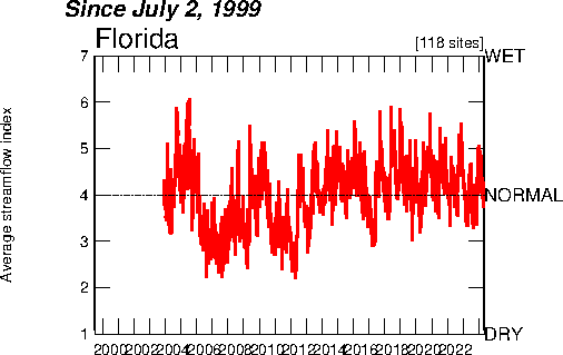 An index value plot allows the reader to be able to determine how the data relates to what is considered normal. In this graph, the average streamflow is measured and the graph shows how that data relates.
 Range graded proportional circle maps are maps that use circles to represent data and those circles' size is determined by the amount of data. For example, the map above's circles are larger depending on the number of Mexicans living in that state.
 Isobars are lines that connect points of equal atmospheric pressure, as in the map above.
 Isoline maps use lines to connect points of points of equal value, in the example above lines of equal wind speed are connected.
 Proportional circle maps portray data to the relative size of the circles. In the above map, the size of the America Indian Population is shown by the size of the circles, the larger the circle the larger the population size.
 Propaganda maps are used to sway the onlooker of the map to what the creator of the map wants. In this case, the map is what Ronald Reagan wanted, or the person who created thinks Ronald Reagan wanted, the world to believe.
 The Public Land Survey System is a way to divide land in the United States into small sections. The above map is an example of the PLSS as it exists in Florida, each red box is a different section.
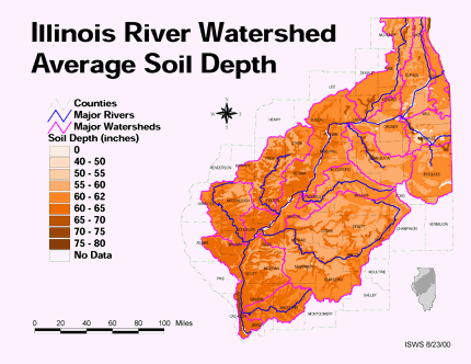 Thematic maps connect a certain geographical area to a particular data set to portray a theme. The above map shows the average soil depth of Illinois using different shades of brown.
 Hypsometric maps portray a geographic area using shading, contour lines, tinting, or relief models. The hypsometric map above is of Goiania, Braizil.
 Triangular plots are an equilateral triangle that use three variables to sum to a constant. The above map is a flammability diagram for methane, it shows what percentage of methane, oxygen, and nitrogen would produce a flammable mixture (shown in orange).
 Dot distribution maps are a type of thematic map that uses dots to display a data set. The above map uses dots to represent participants of a birdwatching project in 2000 and 2001.

 A bivariate choropleth map is essentially the same as an univariate choropleth map except instead of having just one set of data it displays two or more. The above map shows the margin of victory for each candidate of the 2004 Presidential election and the voter turnout percentage per state.
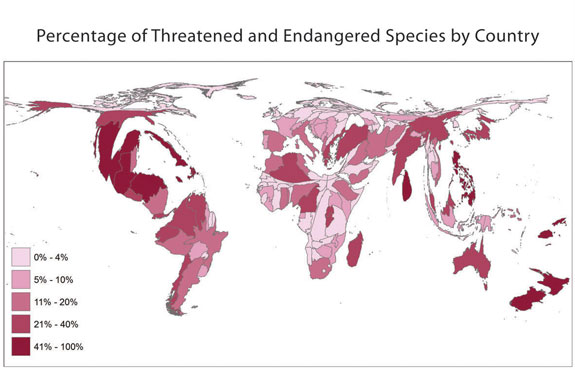 A Cartogram is a cartographic technique that alters a map to enlarge or reduce certain zones based on the data. These distortions help to further along the point that the color shades may not be good enough alone for. The above map is of the percentages of threatened and endangered amphibians in the world.
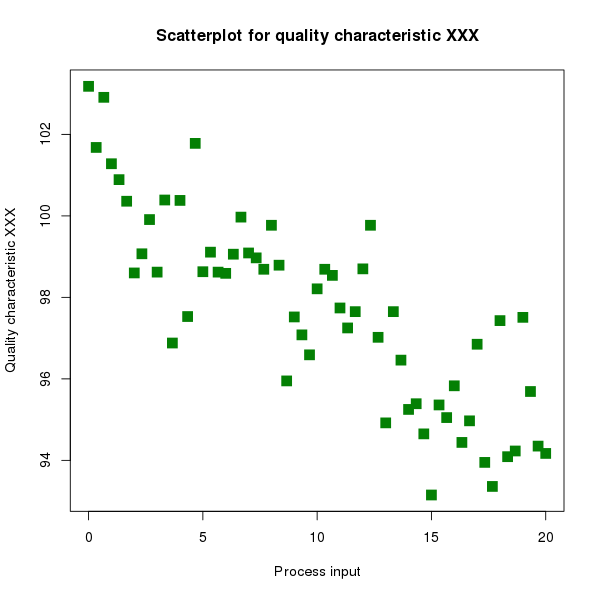 A Scatter Plot displays a collection of points representing a set of data defined by two variables. One variable, usually independent, on the horizontal axis and the second dependent variable on the vertical axis.
 A Cartographic animation is simply a map that has had application of an animation to it. The change is often over time, such as the example above. The map above is the Pentagon as it is being rebuilt from 2001 to 2005.
 A mental map is a person's point-of-view perception to the public world around them. In the example above, it is one persons map to places that they had gone to as a child.
 The Lorenz curve measures the equality or inequality of income distribution data. The curve above is an example of what a Lorenz curve would look like.
 Histograms are graphs that display information as bars which is the frequency of the data. The histogram above is the life expectancy of a person living in the United States. The graph shows that the highest frequency of life expectancy is about ninety years.
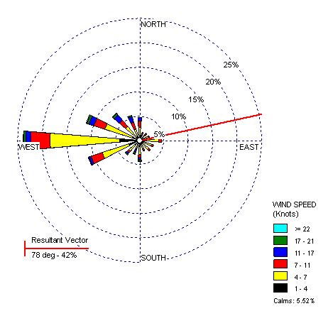 Windrose maps represent the direction of the wind at certain speeds. Based on the length of each vector, you can determine the frequency of the wind at that speed and direction. The above map is based on the wind in Yakima, Washington.
 Flow maps are used to track the movement of objects from one place to another. In the case of the map above, the different truck routes used are shown. The thicker the lines are, the greater number of trucks that used that route, an advantage for flow maps because it reduces visual clutter.
 Star plots are used to graph multiple variables, the chart above is from NASA and is describing the optimal design results for a project.
 Climographs depict the average temperature and precipitation of a certain area, making them easy to understand the climate of an area. The above map shows the climate of Atlanta, Georgia.
 Statistical maps show the variation of a factor by quantity. The above map shows the different ancestries of Americans by county/state.
 Cadastral maps define the boundaries of the area being shown and in the case of the above map, the boundaries of Florida are each county.
 Choropleth maps are the most commonly used type of Thematic maps. They are particularly suited to show data when the area is evenly distributed between set areas, as in states in the map above. The map above shows how much water is used daily by each state.
 A Planimetric map is simply a map that does not show elevation. The above picture is a planimetric map of Tallahassee, Fl. Maps like these are easy to use for directions when one does not need elevations.
 Digital elevation model (DEM) maps focus on topography and the terrain, identifying the elevations of the target area. The above map is of the Great Lake Region and shows each lakes water surface elevation.
 A Digital Raster Graphics (DRG) is a scanned image of a USGS topographic map. This raster image is used often in GIS applications.
 Infrared aerial photography is used by taking infrared pictures. Infrared pictures are made by cameras that are sensitive to infrared light. The infrared pictures make the images have false-color, or colors that the subjects are not normally.
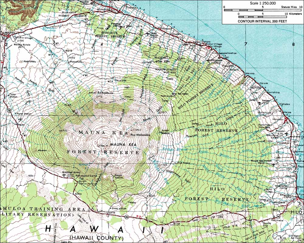 The above map is a topographic representation of Mauna Kae, which is the tallest point in Hawaii. Topographic maps show elevation changes over a given section. The closer the contour lines are, the steeper the slope is. Also, if you look at the contour lines they are labeled by how high the given line is above sea level.
 Doppler radar images are beneficial to meteorologists for use in predicting weather patterns and explaining atmospheric phenomenon. This map is a series of Doppler radar images of Hurricane Katrina as it passes closest to Baton Rogue back in August of 2005. Doppler radar works by sending out bursts of radio waves and then recording the radio waves that are reflected back.

